Welcome to HYM’s Essential Guide to Market Analysis Marketing, perfect for helping you navigate through the bustling marketplace. We’ll equip you with the skills to explore the depths of market trends, customer behaviors, and those sneaky competitors who always seem one step ahead.
Ready to turn “market confusion” into “market confidence”? Let’s discover how mastering market analysis can be your golden ticket to marketing success.
What Is Market Analysis in Marketing?
Market analysis is a comprehensive process that helps businesses understand their industry’s landscape and where they fit within it. It involves conducting a thorough examination of the market’s size, scope, trends, and the competitive landscape.
Think of market analysis as the backbone of your marketing efforts, offering crucial insights into your target market and the broader environment in which you operate.
It involves market research to collect data on potential customers and market size. This step is vital to gauge the scope of opportunities available for your business idea.
Target market analysis helps identify and understand the specific group of customers most likely to engage with your product or service. This analysis helps in tailoring your marketing strategies to meet the needs and preferences of your audience.
Another crucial element is competitive analysis. This involves studying your competitors, understanding their strategies, strengths, weaknesses, and how they meet customer needs.
Market analysis also delves into industry trends, allowing businesses to stay ahead of changes and innovations that could impact their market segment. This foresight is crucial for long-term planning and sustainability.
It’s not just a section of a business plan; it’s a continuous process that informs all aspects of marketing strategy. It helps in understanding market saturation, identifying new opportunities, and making informed decisions.
Why Market Analysis Is Crucial for Your Business
Conducting a market analysis is crucial for the success and growth of any business, regardless of its size or industry.
Comprehensive market analysis provides deep insights into who your potential customers are, what they need, and how they make purchasing decisions.
From product development to pricing strategies, understanding the market ensures that decisions are not based on guesswork but on solid, actionable information.
By analyzing market trends and the competitive landscape, businesses can spot unmet needs in the market. This leads to innovation and the development of unique value propositions that set your business apart.
Knowledge about market size, trends, and saturation helps businesses to assess risks accurately.
With a clear understanding of the market and your target audience, you can create more focused and effective marketing campaigns. This not only improves ROI but also ensures that your marketing efforts are not wasted on uninterested audiences.
Regular market analysis keeps you abreast of industry trends and shifts in consumer behavior. This foresight is essential for long-term planning and adapting to changes in the market.
Decoding Market Size and Scope
Market size refers to the total volume or value of a particular market. But here’s the fun part: understanding market size isn’t just about big numbers; it’s about understanding their potential.
Scope, on the other hand, is about breadth. It’s looking beyond size and asking, “What kinds of opportunities does this market offer?” Imagine you’re at a buffet. The size tells you how much food there is, but the scope tells you about the variety – are we chicken schnitzel or roast beef?
How to Accurately Estimate Market Size
Now, let’s get into the nitty-gritty of how to accurately estimate market size.
Start with Secondary Research: Dive into existing reports, industry publications, and market research.
Conduct Surveys and Interviews: Talk to potential customers.
Use the Bottom-Up Approach: Start small. Look at a segment of your target market, estimate sales, and then scale up.
Top-Down Analysis: This is the opposite. Start with big industry numbers and then narrow down to your specific segment. Think of it as starting from a satellite image and then zooming in on your street.
Keeping Up with Evolving Market Trends
Trends come and go faster than the latest TikTok dance.
Social media isn’t just for memes and cat videos. It’s a goldmine for understanding what’s trending. Platforms like Twitter, Instagram, and LinkedIn can give you real-time insights into what your target audience is buzzing about.
Have you ever thought of your customers as trend forecasters? Regular feedback sessions, surveys, and reviews can tell you what’s hot and what’s not in their world.
Remember, keeping up with market trends is not about chasing every shiny new thing. Focus on the trends that align with your brand and how to adapt them to your strategy.
Predicting Future Trends: Tools and Techniques
The goal here is to not just react to trends but to anticipate them, giving you a head start in the race.
We’re in the era of big data, where predictive analytics tools and AI algorithms can analyze patterns and predict future trends.
Predicting future trends requires a mix of art and science, intuition and data.
Deep Dive into Customer Analysis
Customer analysis relies on you unraveling the complex web of your customers’ desires, needs, and habits. The aim is to understand them on a level that even they might not be aware of.
Start by collecting as much information as possible about your customers. This includes demographics, purchasing habits, social media behavior, and more.
Divide your customer base into segments based on shared characteristics. Understanding how and why your customers make purchases can reveal a lot about their preferences and decision-making processes.
Regularly ask for feedback. This direct line of communication can provide invaluable insights into what your customers think and feel about your brand.
Profiling Your Ideal Customer
Now, let’s get creative and build a profile of your ideal customer.
Start with the basics, like age, gender, location, and income level. Dive into their lifestyle, interests, values, and attitudes. Are they adventurous risk-takers or safety-seeking comfort lovers?
What problems do they face that your product or service can solve? Understanding their challenges is like knowing the plot twists in their story.
What are they striving for in their personal or professional lives? Aligning your brand with their aspirations can create a powerful connection.
Understanding Consumer Behavior and Preferences
Finally, let’s dive into the fascinating world of consumer behavior and preferences. Why do people buy what they buy? What makes them choose one brand over another?
Look at the actions your consumers take – what they buy, when they buy, and how often.
Emotions play a huge role in purchasing decisions. Identify what emotional needs your product or service fulfills. Is it comfort, security, status, or something else?
Stay attuned to broader cultural trends that might influence consumer preferences.
Use stories to connect with consumers. People are drawn to narratives that resonate with their own experiences and aspirations.
Understanding consumer behavior and preferences is like being a part of an ongoing, dynamic conversation. It’s a fascinating exploration of the human psyche and how it interacts with the world of commerce. By mastering this, you can tailor your marketing strategies to resonate deeply with your customers, creating lasting relationships and brand loyalty.
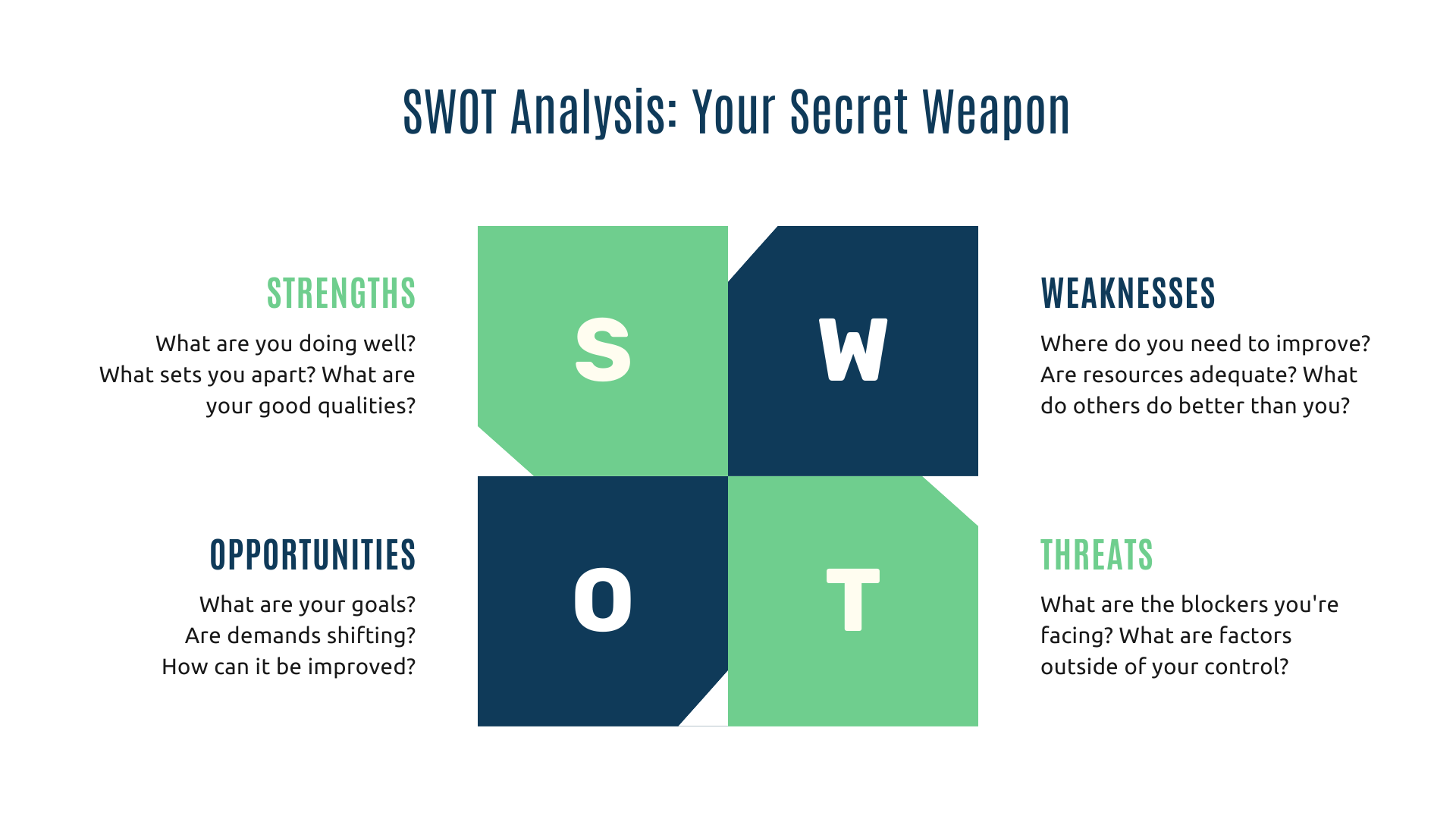
SWOT Analysis: Your Secret Weapon
Imagine having a secret weapon in your business arsenal that helps you see not only where you shine but also where you might stumble. That’s SWOT Analysis for you – a strategic tool that stands for Strengths, Weaknesses, Opportunities, and Threats.
Strengths: These are what you do best. Maybe it’s your unbeatable customer service, your innovative product features, or your rock-solid brand reputation. It’s like knowing your superpowers in a world of competition.
Weaknesses: These are the areas where you might need a bit of a boost. It could be things like limited resources, lack of online presence, or gaps in your product line. It’s about identifying your kryptonite so you can work on it.
Opportunities: These are external factors that you can capitalize on. Maybe there’s a market trend leaning in your favor, or perhaps a competitor has left a gap in the market just waiting for you to fill.
Threats: These are external challenges you might face. It could be anything from new competitors entering the market to changes in customer behavior or regulatory landscapes.
Conducting an Effective SWOT Analysis
So, how do you conduct a SWOT Analysis that’s not just a list but a roadmap to success?
Gather Your Team: SWOT isn’t a solo journey. Involve team members from different departments for a well-rounded view.
Be Brutally Honest: The key to an effective SWOT is honesty. Overestimating strengths or underplaying weaknesses won’t help in the long run.
Research and Data are Your Friends: Back up your SWOT with real data. Market research, customer feedback, and performance metrics can provide concrete evidence to support your analysis.
Keep It Relevant and Specific: Generalizations won’t do the trick. Be specific about what your strengths and weaknesses are, and how the opportunities and threats are relevant to your business.
From Analysis to Action: Turning Insights into Strategies
The real magic of SWOT Analysis happens when you turn those insights into actionable strategies.
Use your strengths to seize opportunities. If you’re known for outstanding customer service, use that to break into new markets or launch new products.
Develop strategies to improve or mitigate your weaknesses. If limited resources are a weakness, maybe it’s time to look into strategic partnerships or outsourcing.
Align your business strategy to take full advantage of identified opportunities. This could mean diversifying your product line, expanding to new markets, or ramping up your marketing efforts.
Develop contingency plans to protect your business against potential threats. This could involve diversifying your supplier base to mitigate the risk of supply chain disruptions or investing in new technologies to stay ahead of competitors.
Remember, SWOT Analysis is not just about knowing your business inside out. By turning insights into action, you’re not just playing defense; you’re gearing up to score big in the business league.
Elevate Your Marketing Strategy Today!
At Hit Your Mark, we’re committed to helping you unlock the full potential of your business.
Whether you’re fine-tuning your marketing approach or seeking fresh, innovative ideas, we’re here to help guide you every step of the way.
So, what are you waiting for? Contact us to see how our market research will benefit you. Explore our blogs for other worthwhile tips and tricks!
Think of your menu as the friendly tour guide of your website, pointing out the must-see attractions and hidden gems tucked away in the corners of your pages.
Whether you’re a blogging newbie or a seasoned webmaster, mastering the art of menu navigation in WordPress can transform your site from a maze of content into a well-organized, user-friendly experience.
Buckle up as we share how to create, customize, andperfect your WordPress navigation menus. Get ready to make your website a destination worthy of exploring!
Understanding WordPress Menus
Menus are more than just a list of links. They are the pillars of your website’s navigation architecture.
Understanding how these menus work, from their structural composition to their interactive elements, is key to mastering theoverall UX of your website.
Each menu you create is a chapter, leading your audience through the narrative of your website, ensuring a user-friendly and engaging experience.
Basics of Menu Functionality
Menus in WordPress are versatile tools that allow you to link to various content types, like pages, posts, categories, and custom links.
You can create multiple menus for different purposes, such as main navigation, footers, or social links.
Each menu item can be easily added, edited, or rearranged through the WordPress dashboard, offering flexibility in how you present your site’s structure.
Menu Locations and Themes
Menu locations vary depending on the theme you use. Most themes offer primary menu locations, typically at the top of your site, and secondary locations like footers or sidebars.
These locations are predefined by your theme and are designed to integrate seamlessly with its overall design. Choosing the right theme can significantly impact how your menus are displayed and interacted with, ensuring they complement your site’s aesthetic and enhance user experience.
By understanding these elements, you can effectively organize and present your site’s content, making navigation a breeze for your visitors.
Creating Your First WordPress Menu
Setting up your first WordPress menu can significantly enhance your website’s user experience. A well-organized menu guides your visitors through your site’s content effortlessly and reflects your website’s professional structure.
Think about the most important pages or sections that your audience should visit. These could be your home page, about page, services, blog, or contact section. Prioritize these in an order that makes sense and is easy to navigate.
Step-by-Step Menu Setup
Creating a menu in WordPress might seem daunting at first, but by following a few simple steps, you can set up a functional and aesthetically pleasing navigation menu.
Access Menu Editor: In your WordPress dashboard, navigate to ‘Appearance’ and select ‘Menus’.
Selecting a Menu Location: Once you’ve named your menu, the next step is to choose where it will be displayed on your website. Most themes offer several locations, such as the header, footer, or sidebar.
Adding Menu Items: To add items to your menu, simply select pages, categories, or custom links from the left-hand panel and click on ‘Add to Menu.’ You can add various content types to your menu, including posts, categories, and custom links.
Organizing Menu Items: Drag and drop the items to arrange them. Sub-items can be created by dragging an item slightly to the right of another item, creating a drop-down effect in your menu.
Customizing Menu Items: Click on any menu item to edit its navigation label or remove it from the menu. You can also add custom CSS classes for advanced styling (optional).
Saving Your Menu: Don’t forget to click ‘Save Menu’ once you’re satisfied with your menu’s structure.
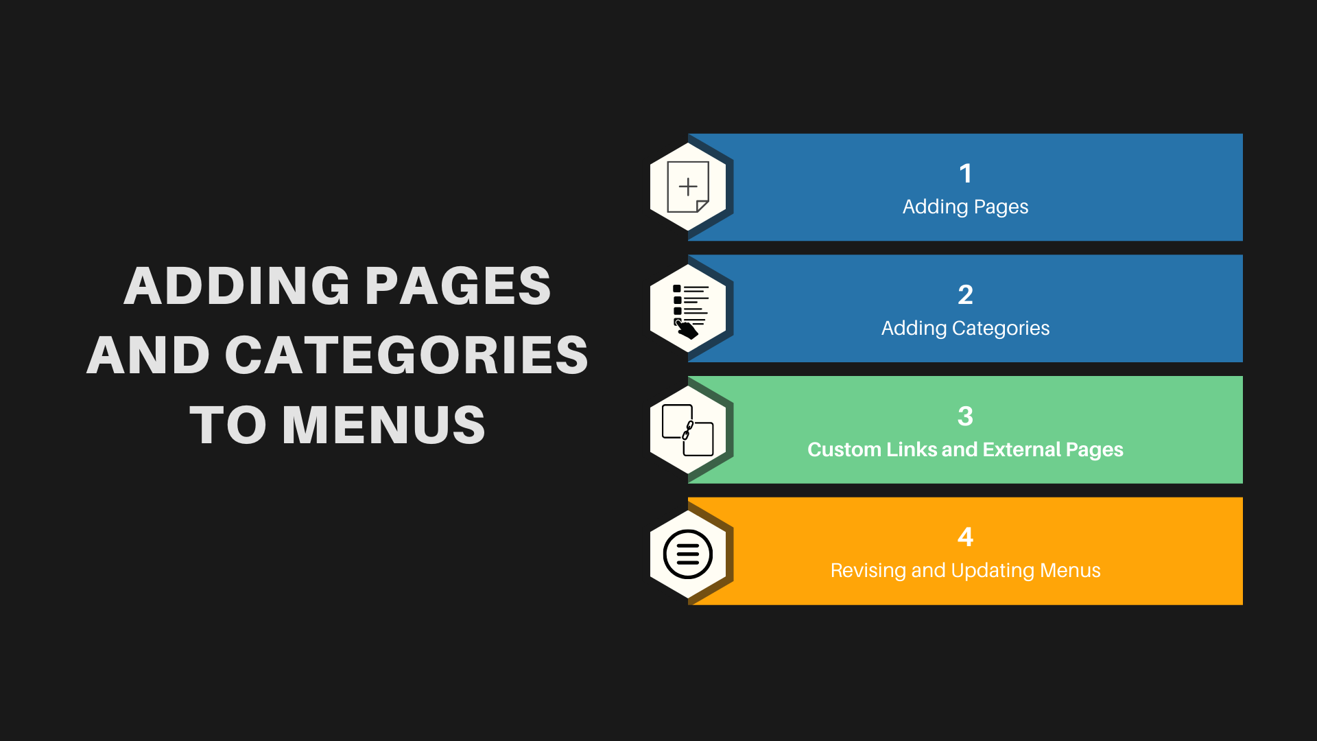
Adding Pages and Categories to Menus
Adding pages and categories to your WordPress menu enhances its functionality, making it easier for visitors to find what they’re looking for on your site.
Adding Pages: To add a page to your menu, go to the ‘Pages’ panel on the left-hand side, select the pages you want to add, and then click ‘Add to Menu’. You can add any pages you’ve created, from your home page to custom landing pages.
Adding Categories: Similarly, to add categories, switch to the ‘Categories’ panel. This is particularly useful for blogs or websites with a lot of content, as it helps visitors to navigate through different topics or services.
Custom Links and External Pages: Don’t limit your menu to just your own pages and categories. You can add custom links to direct visitors to external sites or resources, or to sections within a page on your website.
Revising and Updating Menus: Your menu isn’t set in stone. As your website grows, regularly revisit your menu structure to ensure it continues to serve the needs of your visitors effectively.
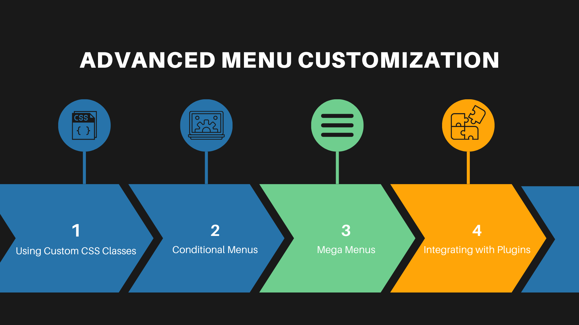
Advanced Menu Customization
Once you’re comfortable with the basics of WordPress menu management, you can dive into advanced customization. This allows you to tailor the navigation experience to fit your website’s unique style and your audience’s needs.
Using Custom CSS Classes: Within the menu item settings, you have the option to add custom CSS classes. This feature is invaluable for those who want to apply specific styles to certain menu items, like changing colors or font sizes.
Conditional Menus: Some themes and plugins offer the functionality to display different menus based on certain conditions, like a user’s logged-in status or the page they’re viewing.
Mega Menus: Mega menus can be a game-changer for sites with extensive content. These larger menus can feature multiple columns of links, images, and even widgets. They’re ideal for e-commerce sites or large blogs.
Integrating with Plugins: There are numerous plugins available that can enhance your menu’s capabilities. The possibilities are endless, from adding image icons to menu items to creating fully responsive sliding menus.
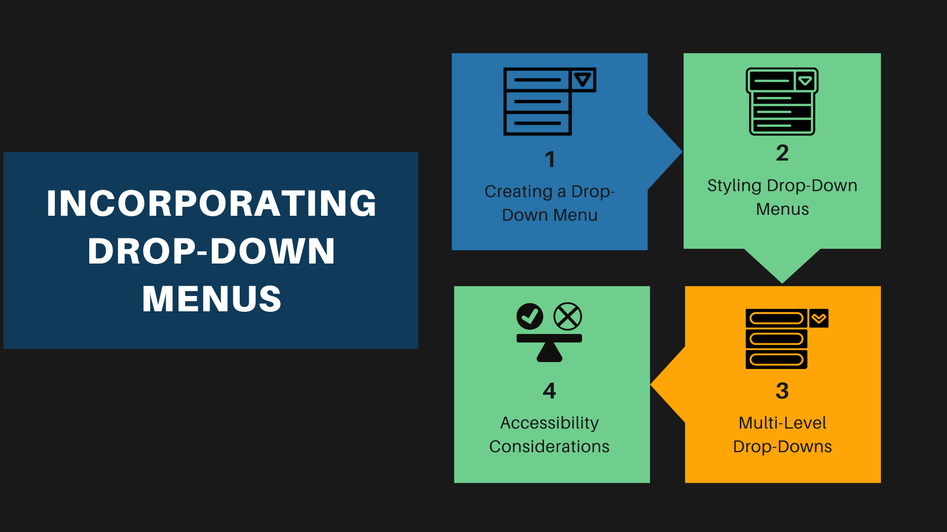
Incorporating Drop-Down Menus
Drop-down menus are a fantastic way to organize your site’s navigation when you have multiple layers of content. They help keep your menu compact and your site uncluttered.
Creating a Drop-Down Menu: In your WordPress menu structure, drag a menu item slightly to the right of the menu item above it to create a sub-item. This automatically turns it into a drop-down menu.
Styling Drop-Down Menus: You can style your drop-down menus by going to the ‘Customize’ section under ‘Appearance.’ Here, you can adjust colors, fonts, and even animations for how the drop-down appears.
Multi-Level Drop-Downs: For deeper navigation, you can create multi-level drop-down menus. However, it’s important to ensure that these are still easy to navigate and don’t overwhelm the user.
Accessibility Considerations: Ensure that your drop-down menus are accessible, particularly for users navigating via keyboard or screen readers. This is not just good practice but also broadens your site’s audience.
Custom Links and Navigation Labels
Custom links and navigation labels in your WordPress menu offer a level of personalization and functionality that can significantly improve the user experience on your site.
Adding Custom Links: You can direct your visitors to external sites or specific sections within your site by using custom links. This is particularly useful for linking to social media profiles or affiliate websites.
Renaming Navigation Labels: While adding items to your menu, WordPress uses the title of the page or category by default. However, you can rename these to more user-friendly or concise terms to enhance clarity and navigation efficiency.
Utilizing HTML in Labels: For a more creative touch, you can incorporate HTML elements like icons or different font styles within your navigation labels. This can help make your menu more visually appealing and intuitive.
Link Target Options: When adding custom links, you can choose whether they open in the same window or a new tab. This can be crucial for keeping visitors on your site when linking to external resources.
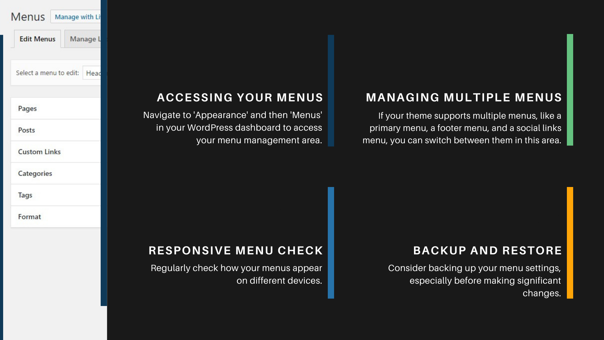
Managing Your Menus
Efficiently managing your WordPress menus is key to maintaining an organized and user-friendly website. Regular management ensures that your navigation reflects the latest content and layout of your site.
Accessing Your Menus: Navigate to ‘Appearance’ and then ‘Menus’ in your WordPress dashboard to access your menu management area. Here, you can select which menu you want to edit from a drop-down list of all your menus.
Managing Multiple Menus: If your theme supports multiple menus, like a primary menu, a footer menu, and a social links menu, you can switch between them in this area. This allows you to tailor different parts of your site’s navigation.
Responsive Menu Check: Regularly check how your menus appear on different devices. With the increasing use of mobile devices, ensuring that your menus are mobile-friendly is crucial.
Backup and Restore: Consider backing up your menu settings, especially before making significant changes. This way, you can easily restore a previous version if needed.
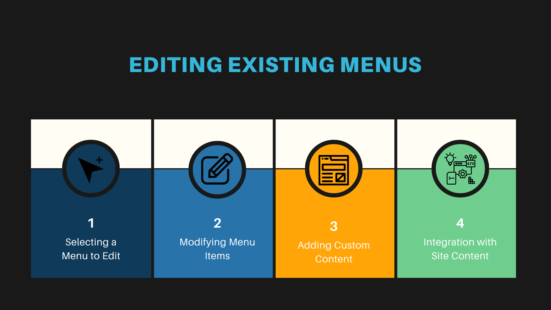
Editing Existing Menus
Editing existing menus in WordPress is a straightforward process that allows for continuous improvements and updates to your site’s navigation structure.
Selecting a Menu to Edit: In the ‘Menus’ section of your WordPress dashboard, choose the menu you want to edit from the drop-down list.
Modifying Menu Items: Click on any menu item to expand it. Here, you can change the navigation label, the title attribute, or the link target.
Adding Custom Content: Besides pages and categories, consider adding custom post types or tags to your menu if your theme supports them.
Integration with Site Content: Ensure your menu is aligned with the content of your site. As you add or remove pages or posts, update your menu to reflect these changes.
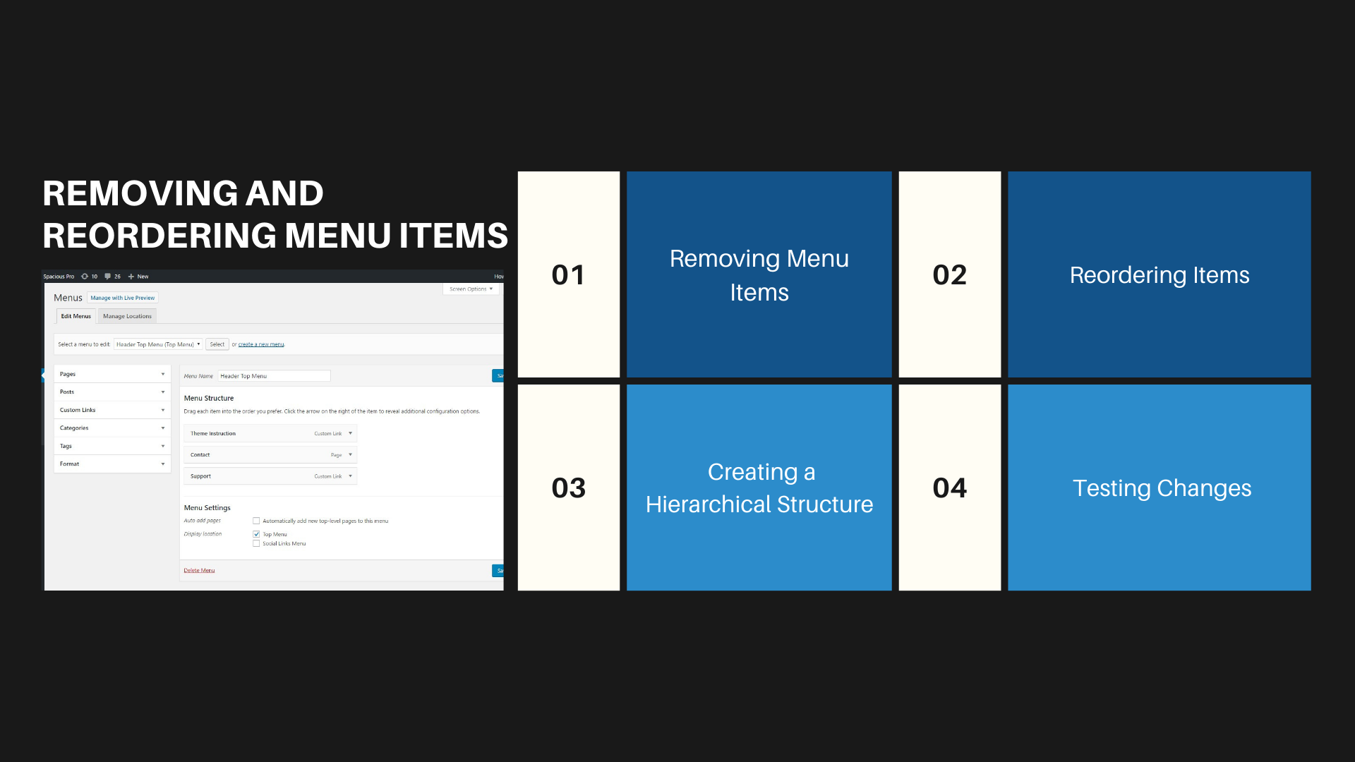
Removing and Reordering Menu Items
Regularly updating your menu involves not just adding new items but also removing and reordering existing ones. This keeps your navigation streamlined and relevant.
Removing Menu Items: To remove an item, simply click on the arrow icon in the top right-hand corner of the menu item box to expand it, and then click ‘Remove.’ Remember, removing an item from the menu does not delete the page or category itself.
Reordering Items: Click and drag menu items to reorder them. The order in your menu editor is how they will appear on your website. Consider the flow of your site and how users typically navigate content when deciding on order.
Creating a Hierarchical Structure: Use drop-down menus to organize related items under broader categories. This not only cleans up your menu but also helps users navigate your site more intuitively.
Testing Changes: After making changes, always preview your site to see how the menu functions. Pay special attention to the usability on different devices, especially mobile phones and tablets.
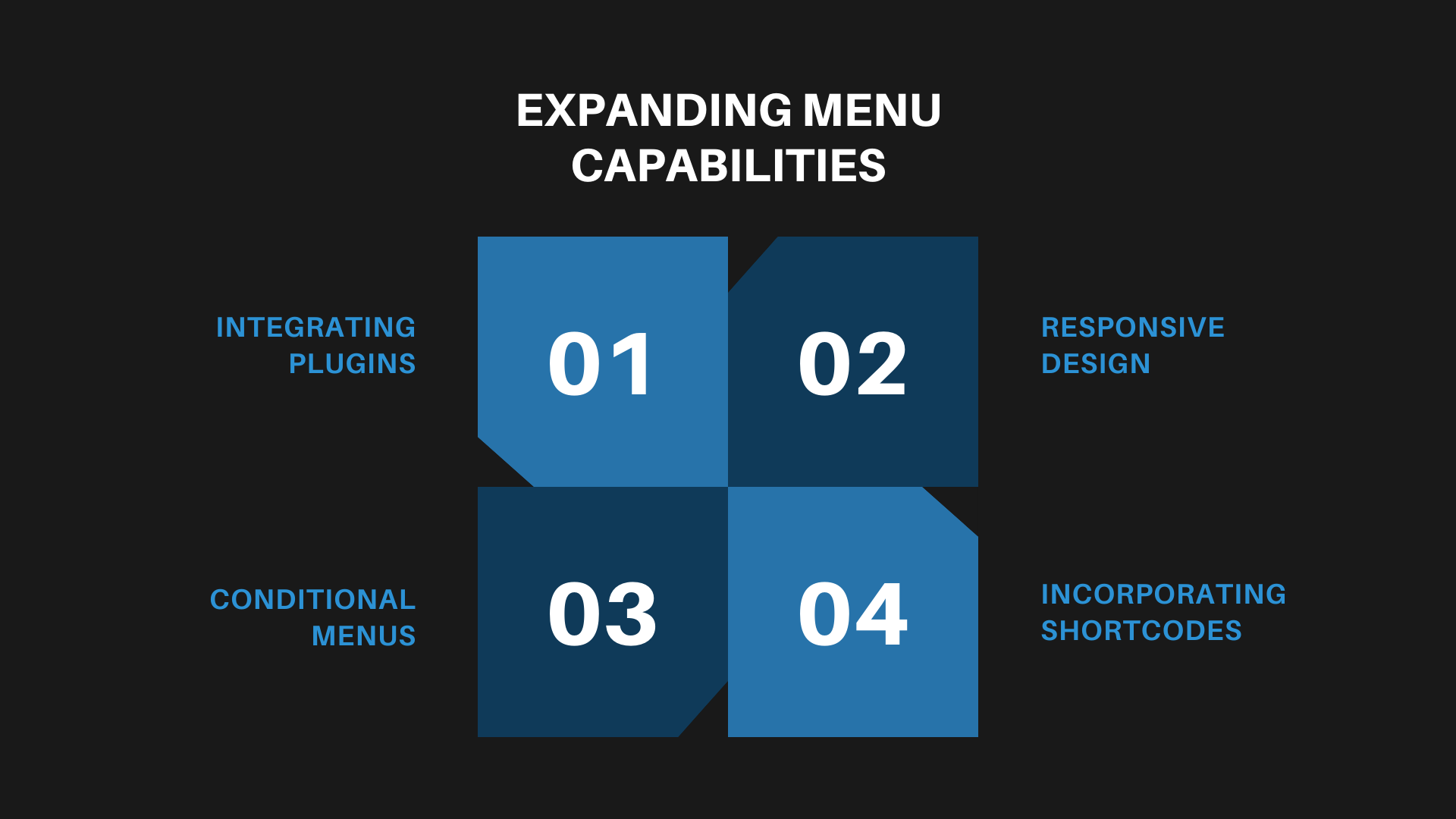
Expanding Menu Capabilities
Expanding the capabilities of your WordPress menus can significantly enhance the functionality and aesthetic appeal of your website, offering a more engaging user experience.
Integrating Plugins: Utilize plugins to add advanced features to your menus, like animations, mega menus, or even dynamic content based on user behavior or profiles.
Responsive Design: Ensure your menus are responsive and mobile-friendly. This often requires different menu styles or structures on different devices.
Conditional Menus: Explore the use of conditional menus that change based on specific criteria, such as user login status, time of day, or the page being viewed.
Incorporating Shortcodes: Some themes and plugins allow the use of shortcodes in menus, enabling you to add unique elements like search bars, CTA buttons, or language switchers directly into your navigation.
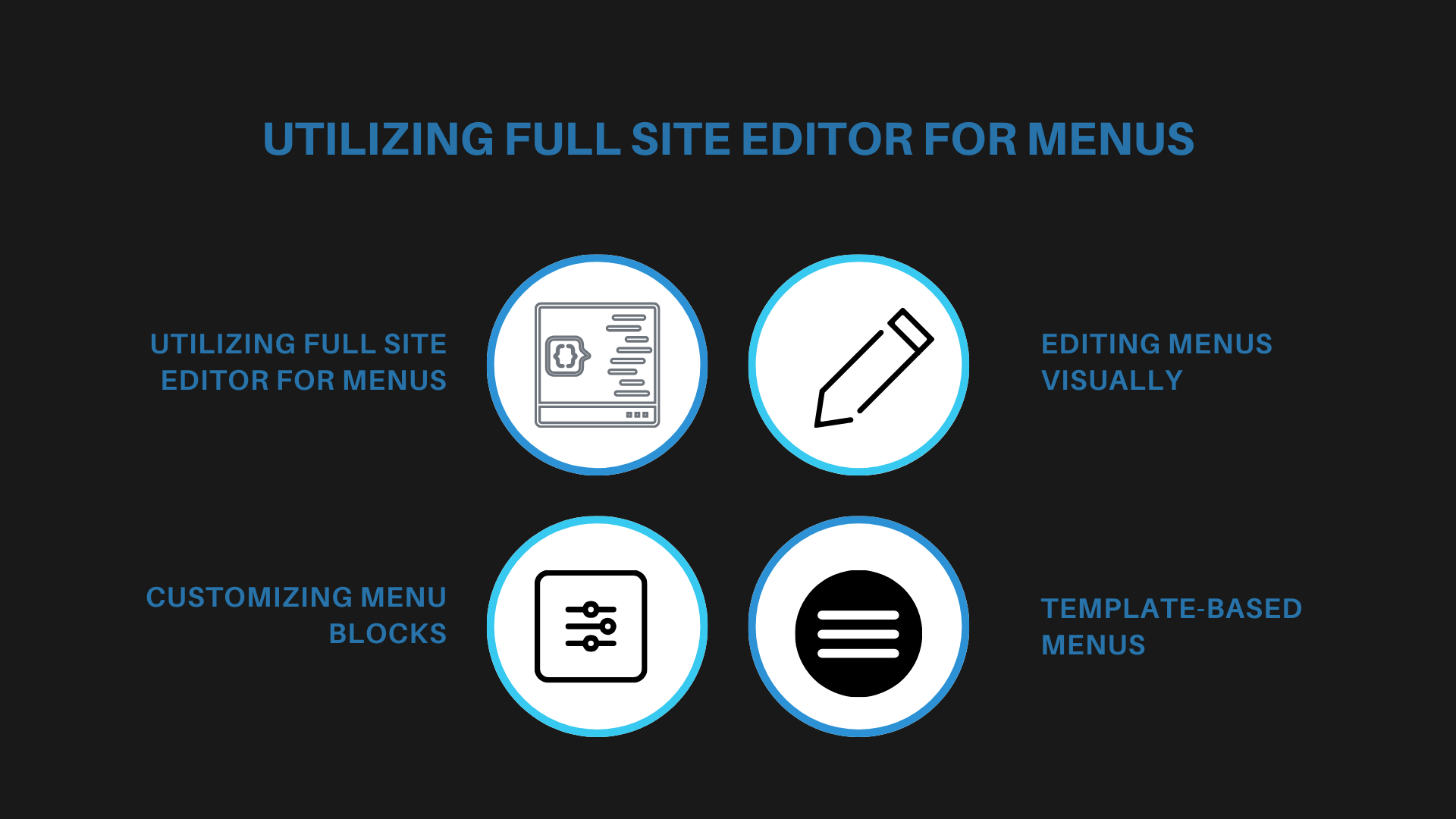
Utilizing Full Site Editor for Menus
With the introduction of the Full Site Editor in WordPress, customizing menus has become more intuitive, offering a more visual approach to menu management.
Accessing Full Site Editor: Navigate to ‘Appearance’ and select ‘Editor’ (provided you’re using a block-based theme) to access the Full Site Editor. Here, you can manage menus alongside other site elements.
Editing Menus Visually: The Full Site Editor allows you to edit menus in a WYSIWYG (What You See Is What You Get) environment, making it easier to visualize changes in real time.
Customizing Menu Blocks: Take advantage of the block-based approach to add, remove, or rearrange items with simple drag-and-drop actions. You can also customize individual menu items with additional styling options.
Template-Based Menus: Experiment with different templates or template parts for menus, such as unique designs for headers or specific page layouts.
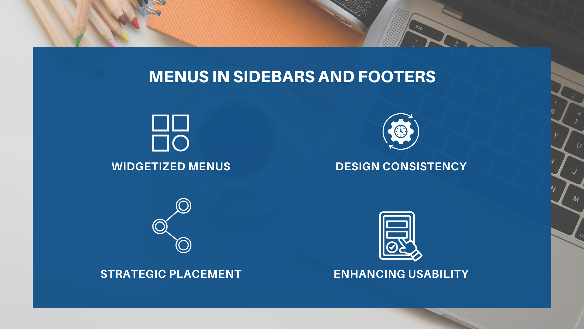
Menus in Sidebars and Footers
Incorporating menus into your website’s sidebars and footers can improve navigation and accessibility, making it easier for users to findimportant CTAs, links, and information.
Widgetized Menus: Most WordPress themes support widgetized sidebars and footers. You can add a custom menu to these areas by using the ‘Navigation Menu’ widget.
Design Consistency: Ensure that your sidebar and footer menus complement the overall design of your site. They should be visually distinct yet cohesive with your main navigation.
Strategic Placement: Use sidebar and footer menus to offer links to secondary content, like privacy policies, contact information, or social media profiles. This helps declutter your main menu.
Enhancing Usability: Consider adding a search bar or a list of popular posts to your sidebar for added functionality. In footers, sitemap-style menus can be very effective for comprehensive navigation.
Ready to Elevate Your Website?
At Hit Your Mark, we’re more than just a digital marketing agency. We’re your turnkey solution to online success.
Specializing in crafting polished, responsive websites, we bring your brand’s vision to life with a blend of creativity and cutting-edge technology.
But our expertise doesn’t stop there. Dive into our treasure trove of marketing insights on our blog, where we share the latest tips and strategies to keep you ahead of the curve.
Who could have imagined in the 80s that today, we’d be wielding devices that serve as a gateway to endless shopping adventures and possibilities?
That’s why, for eCommerce store owners, phones are more than just a gadget—they’re the frontline of customer interaction!
We’ll unveil 3 powerful ways to optimize your eCommerce store for mobile users:
Speed
Simplicity
Seamless user experience
These aren’t just buzzwords; they’re the pillars of a thriving mobile strategy that turns visitors into loyal customers!
What Is eCommerce Optimization?
At its heart, eCommerce optimization is about creating the best eCommerce experience possible for you and your customers.
It involves fine-tuning various eCommerce features, such as:
User-friendly web design
Intuitive navigation
Effective search engine optimization
This optimization process includes ensuring your eCommerce platform speaks the language of your target market. It involves optimizing product descriptions, ensuring your brand values shine through every pixel, and setting up an automated sales tax system for hassle-free transactions.
Why Is Mobile Optimization Relevant for eCommerce?
Mobile optimization is the secret ingredient for all eCommerce websites.
Its sales accounted for 72.9% of total eCommerce sales in 2021!
Without a mobile-optimized eCommerce site, you’re essentially turning away business.
It’s like having a brick-and-mortar store with a “gone for lunch” sign that you keep forgetting to take down—not exactly the brightest eCommerce strategy!
Mobile optimization ensures that every aspect of your eCommerce store functions seamlessly on mobile devices. This involves responsive web design, where your site adjusts beautifully to any screen size and faster loading times to engage those on-the-go shoppers.
Mobile users tend to have a higher cart abandonment rate than desktop users, making a quick, intuitive mobile experience even more valuable.
Moreover, search engines love mobile-optimized sites. This translates into better search results and more visibility for your store.
Statistics show that 70% of mobile searches lead to online action within an hour, emphasizing the importance of optimizing for mobile searches.
Over 50% of internet traffic comes from mobile devices. If you want to start selling online, ignoring mobile optimization is a critical business oversight!
How Do You Optimize eCommerce Content?
Optimizing your eCommerce content is about strategically enhancing it to drive business success.
79% of online shoppers say they won’t return to a website if they’ve had trouble with load speed. That’s a big chunk of potential customers!
To optimize your eCommerce content, focus on tailoring your site to meet your target audience’s specific needs and preferences. Use engaging product descriptions, high-quality images, and user-generated content to enhance product pages.
Ensure your eCommerce store consistently reflects your brand image and values across all pages.
Remember, content optimization is a powerful tool in the eCommerce industry, capable of turning browsers into buyers and clicks into sales!
Streamline Mobile Navigation and Layout
Navigating some mobile sites feels like finding your way through a maze blindfolded.
Not fun, right?
When designing your eCommerce site, consider mobile navigation and layout as your customer’s lighthouse, effortlessly leading them to where they need to go.
Simplicity and ease of use are king.
To optimize your eCommerce site for mobile, streamline your navigation and layout.
This means a clean, uncluttered design with intuitive menus and accessible product categories.
Simplify your user interface to ensure that even new customers can easily find what they want.
Most eCommerce website builders offer responsive design templates, but it’s up to you to customize them for your online store.
A well-organized mobile layout significantly enhances user experience, encouraging potential customers to explore more and, ultimately, make a purchase.
7 Tips to Streamline Your Mobile Site
Minimalistic Design: Go Marie Kondo on your site. If something doesn’t spark joy (or sales), it doesn’t need to be there. A clutter-free interface not only looks good but also enhances usability.
Hamburger Menus: These little three-lined icons are a small business’s best friend. They tuck away all your navigation needs neatly, ensuring customers don’t have to wade through a sea of links.
Thumb-Friendly Design: Most people use their phones one-handed. Place your navigation menu, call-to-action buttons, and essential links within easy thumb reach.
Clear Call-to-Action Buttons: Your “Buy Now” or “Learn More” buttons should stand out like a flamingo at a penguin party—impossible to miss and attention-grabbing.
Predictive Search: Implement a smart search bar that anticipates what your customers want, making their shopping experience smoother than a silk robe.
Category Filters: Filters are your secret weapon if you sell various products. They help customers narrow down their options without the headache of scrolling through endless items.
High-Contrast Colors: Use colors that pop and make reading effortless. No one should have to squint to see your “Add to Cart” button.
Keep It Simple and Intuitive
Imagine a new customer landing on your site.
They shouldn’t need a map and compass to find your product categories.
Companies like Apple and Nike have mastered this art.
Just look at their mobile sites; you’ll notice clean lines, minimalistic design, and a navigation bar that’s as easy to use as a light switch.
Their mobile layout is a symphony of good design—it’s intuitive, visually appealing, and makes finding your favorite tunes a breeze.
Or look at Airbnb—their mobile site is so user-friendly, you could probably book a dream getaway with your eyes half-closed!
Streamlining your mobile navigation and layout is more than just making things look pretty. It’s about creating an easy, enjoyable experience that smoothly leads customers from browsing to buying.
Enhance Mobile Loading Speed and Performance
Imagine two shoppers: Speedy Sam and Waiting Wendy.
Speedy Sam visits a site that loads quicker than he can say “add to cart.”
Meanwhile, Waiting Wendy ends up on a slow site, twiddles her thumbs, gets frustrated, and finds it hard to locate the product she’s looking for.
Who is likely to actually make a purchase?
Speedy Sam, of course!
Speed is a game-changer for eCommerce stores. A one-second delay in mobile load times can impact conversions by up to 20%.
Use optimized images, leverage browser caching, and minimize redirects to enhance your mobile site’s loading speed and performance. Choose an eCommerce platform or website builder known for its performance efficiency.
Remember, the faster your eCommerce site loads on mobile devices, the more likely you will retain and convert visitors into customers.
Prioritize speed optimization in your marketing strategy to ensure a smooth and quick shopping experience for your users!
Boosting Your Site’s Need for Speed
Optimize Your Images: Think of heavy images like anchors slowing your site down. Optimize them for the web so they load faster without losing quality. Tools like TinyPNG are great for this task.
Leverage Browser Caching: This step is like giving visitors a shortcut to your site. It stores parts of your site in their browser, so it loads faster the next time they visit!
Minimize Redirects: Every redirect is a pit stop on the road to your site. The fewer there are, the faster the journey.
Choose a Speedy Ecommerce Platform: Not all eCommerce platforms are built for speed. Platforms like Shopify or BigCommerce are known for their zip. Think of them as the sports cars of the eCommerce world.
Use a Content Delivery Network (CDN): This is like having multiple delivery trucks for your site’s content, ensuring it reaches your users quickly, no matter where they are.
Real-World Speedsters
Great eCommerce website design means prioritizing the optimization of your mobile site’s speed.
It’s about creating a smooth, quick, and enjoyable shopping experience.
After all, in the digital shopping world, the fastest sites get the prize—happy, returning customers!
Think Amazon—a site so fast, you can buy something in the time it takes to sneeze. Or Zara, whose lightning-fast load times make online shopping as swift as a catwalk strut.
Improve Mobile Checkout and Payment Processes
Checkout—the final hurdle where your customers transform from browsers to buyers. A smooth checkout process is like a well-oiled slide; it should be so effortless and fun that your customers can’t wait to zoom down again.
The Art of Simplifying Checkout
Fewer Steps, More Smiles: Cut down on unnecessary fields and stages. Remember, every additional click is like asking your customers to do one more pirouette—some might decide to sit this dance out!
Offer a Buffet of Payment Options: Variety is the spice of life, and this holds true for payment options, too. Whether it’s credit cards, PayPal, or Apple Pay, offering multiple payment gateways is like offering a buffet—there’s something for everyone.
Security Is Cool: In the world of online payments, security is not just important; it’s reassuring. Use reliable payment processing systems and showcase those security badges proudly. Let your customers know, “Your money is safe with us!”
Automated Sales Tax: Nobody likes to do math while shopping. Automated sales tax calculation ensures a hassle-free experience for both you and your customers!
They turn shopping sprees into a breezy affair with their quick, easy, and secure checkout.
These companies understand that a great checkout experience is like a cherry on top of the shopping sundae.
Optimizing your mobile checkout process isn’t just about getting those sales over the line; it’s about creating a delightful, trust-building experience that leaves your customers thinking:
“Wow, that was easy! I’ll be back for more.”
Is SEO Important for eCommerce?
Absolutely!
SEO is the neon sign that guides customers to your online store. It’s crucial for the visibility and success of your eCommerce business.
By optimizing your site for organic traffic, you’ll increase the likelihood of appearing in top search results, attracting more potential customers to your platform. This is especially vital for eCommerce sites that depend upon search engines to drive new and returning visitors!
3 Essential Mobile SEO Factors for eCommerce
SEO is the secret sauce that makes your website irresistibly clickable.
It’s what stands between blending in and standing out in the vast ocean of online stores.
Here are three mobile SEO factors that are essential to your eCommerce site:
Responsive Design: Ensure your eCommerce website is mobile-friendly. A responsive design enhances user experience and improves your site’s ranking in mobile search results.
Site Speed: Online stores with faster loading times keep visitors engaged, reducing bounce rates. Optimize images, leverage caching, and choose an efficient eCommerce platform to keep your pages zipping along.
Local SEO: If you sell in person or have a physical location, local SEO is your best friend. Optimize for local search terms and ensure your business details are accurate across all sales channels. This step will help attract customers both online and to your brick-and-mortar business!
The 3 Best SEO Tools for eCommerce
Just like a master chef needs the best ingredients, a master of SEO needs the best tools.
Here are 3 Swiss Army knives of SEO for your eCommerce toolbox:
Google Analytics: It’s free, powerful, and indispensable for understanding your eCommerce site’s traffic. Track organic traffic, monitor user behavior, and gather insights to tailor your SEO strategy.
SEMrush: A comprehensive tool that offers detailed keyword analysis, competitor insights, and SEO audit features. Perfect for eCommerce businesses looking to gain an edge in search rankings.
Ubersuggest: Known for its user-friendly interface and robust SEO features, Ubersuggest helps with keyword research and site audits while offering valuable insights into improving your search engine visibility.
Uplevel Your Mobile eCommerce Experience!
It’s time to turn your online store into a mobile masterpiece that captures hearts and sales!
Embrace the power of streamlined navigation, lightning-fast loading speeds, and a checkout process smoother than a silk scarf with our eCommerce strategy.
Schedule a call to start transforming your eCommerce site, or visit our Blog Hotte Spotte for more exciting and, most importantly, helpful marketing tips!
Manila, Philippines – A shared commitment to continuous learning and collaboration is at the heart of every thriving technology and marketing community. Hit Your Mark, a dynamic digital marketing and WordPress development player proudly upheld these values by being a Silver Bonifacio Sponsor at WordCamp Manila 2023.
What is WordCamp?
WordCamp is an internationally recognized conference that focuses on everything WordPress. It is a series of locally organized events that bring together WordPress enthusiasts, developers, designers, marketers, and users to share their knowledge and experiences with the community. WordCamp brings an opportunity for attendees to learn from industry leaders in workshops and speaker sessions while building connections with like-minded professionals.As of the time of writing, WordCamps are hosted in an impressive 65 countries across six continents. This global reach underlines the universal appeal and influence of WordPress as a tool for building digital platforms. It also demonstrates the commitment to knowledge sharing and community collaboration within the WordPress ecosystem.
The Story of WordCamp Manila
WordCamp Manila has a rich history as a beacon for the WordPress community in the Philippines. It offers a platform for professionals and enthusiasts to share insights, forge connections, and stay abreast of the latest trends in WordPress and digital marketing.The first WordCamp in the Philippines took place in 2008, marking a significant milestone as the first WordCamp in Asia. Since then, it has been known as WordCamp Manila and hosted in the bustling capital city of the country. This annual event continues to bring together WordPress enthusiasts, fostering a vibrant community of learning, collaboration, and inspiration.
WordCamp Manila 2023: A Hub of Learning
The highly anticipated return of WordCamp Manila in 2023, after the pandemic, has sparked immense enthusiasm and eager anticipation among attendees.This year’s event presented a wide range of topics, covering areas such as running a WordPress business, sharing best security practices, exploring block themes, and utilizing WordPress for enterprise analytics. It provided a comprehensive learning experience for all attendees, ensuring a diverse and enriching program.
Celebrating the WordCamp’s Sponsors
WordCamp Manila 2023 was supported by various sponsors, with Hit Your Mark taking a prominent position as a Silver Bonifacio Sponsor. Other major sponsors include Almighty Support, WordPress.com, Siteground, GoDaddy, Weglot, and Bluehost. Their participation underscores a commitment to the growth and success of the WordPress community.
Hit Your Mark’s WordCamp Sponsorship
Hit Your Mark is a leading digital marketing and WordPress development agency that has achieved remarkable success in building powerful online platforms for clients. Their expertise and experience in the industry make them an ideal partner for businesses looking to grow their online presence.The decision to sponsor WordCamp Manila 2023 aligns perfectly with Hit Your Mark’s values of continuous learning and community collaboration. It provided an opportunity for the team to share their knowledge and insights with fellow professionals while contributing to the growth of the WordPress community in the Philippines.Merald Ayson, Head of Client Support at Hit Your Mark, successfully coordinated the company’s sponsorship for WordCamp Manila 2023.
“We are delighted to be a part of this event, as it provides us with a valuable opportunity to engage with WordPress enthusiasts and professionals while actively contributing to the growth of the community in the Philippines,” Merald said.
Team Hit Your Mark at the Event
Alongside Merald, Philippine-based team members Barbara Colar, Kathleen Hernandez, Sheen Bibay, Christlyn Culimay, and Zarah Majam represented Hit Your Mark, embodying the company’s passion for learning and community engagement. The team actively participated in the event’s sessions, exchanging insights and knowledge with fellow attendees. Additionally, they showcased the company’s services and career opportunities through the Hit Your Mark sponsorship booth, effectively connecting with the event participants.
Looking Ahead: WordCamp Manila 2024
Hit Your Mark is excited to announce its intention to continue supporting WordCamp Manila in 2024, affirming its commitment to the WordPress and digital marketing community. The company looks forward to exploring new and innovative ways to support and collaborate with fellow professionals at the next edition of this highly anticipated event.
“Our continued engagement with WordCamp Manila underlines our unwavering commitment to the WordPress community in the Philippines. We firmly believe in fostering an environment of growth, learning, and collaboration, and we look forward to contributing to and participating in future WordCamps. This is more than a sponsorship for us; it’s a partnership that we cherish and hope to maintain for years to come,” Derek Archer, the CEO of Hit Your Mark said.
About Hit Your Mark
Hit Your Mark is a forward-thinking digital marketing and WordPress development company, driven by a team of passionate professionals committed to delivering results and fostering growth. Learn more at hityourmark.io.


Recent Comments